

My Role
I worked closely with the product manager throughout this project. After gathering and consolidating requirements from the sales team and executives during joint meetings, the product manager outlined the overall direction for the redesign. From there, we discussed possible solutions to address the key problems. Finally, I was responsible for delivering the complete UI and visual design of the project.
User Research
We began by holding group meetings with the stakeholders who had the closest contact with clients—the sales team—to gather their feedback and insights.
Through this process, we gained an initial understanding of the challenges clients were facing with the current system. Based on these findings, we decided to focus first on improving the user flow and redesigning the UI. Once the new version was launched, we planned to continue refining the portal through iterative updates informed by real user feedback.


Problems
Due to space constraints, this case study highlights only the areas that most impacted the core user experience—namely, the UI redesign, the presentation of the homepage, and the optimization of one particularly confusing yet important feature: the “Promotion Settings” workflow and interface.
1. Rigid UI Framework and Presentation
The UI of the Ushow Admin Portal was built entirely with the Bootstrap framework, without any design considerations. As a result, the layout felt monotonous and rigid. For example, most pages displayed information exclusively in tables, even though not all types of content are best suited for that format.
In addition, the visual style lacked any brand identity. Component shapes and colors were inconsistent, leaving the overall interface fragmented and unpolished.

All information was displayed in tables.
2. Wasted Space on the Homepage
As the entry point to the entire portal, the homepage is the first page users see before performing any actions. However, when there were no sales records for the day, the page appeared completely blank. This not only confused users but also wasted valuable space on such a critical screen.

The blank page conveyed no information and left users confused.
Once sales records were available, the data was displayed in a pie chart. However, this was not an ideal way to present the information. As the number of products increased, it became difficult to clearly see the sales ranking of each item.

Interface after sales records are generated
3. Unintuitive Logic and Poor User Experience
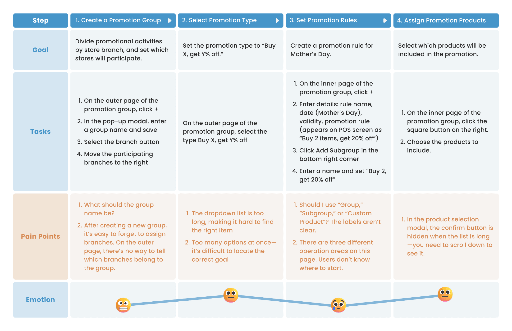
For example, let’s look at the process of setting up promotions.
Promotion Settings – Outer Page
Unclear Promotion Status
Expired promotions still remained within the list, yet the outer page displayed no information about their dates or statuses. As a result, users had to spend extra time searching through outdated promotions one by one in order to edit or delete them.
Inefficient Search Flow
Sometimes users needed to find which promotion a specific product was included in. However, after searching for the product in the bottom-right search bar, they couldn’t directly access the promotion’s settings page. Instead, they had to manually locate the promotion from the left-side list and click “Edit” before making any further changes.

Search results could not be directly selected for action.
Promotion Settings – Inner Pages
Confusing Page Titles
The labels “Group,” “Subgroup,” and “Custom Product” were unclear and failed to convey their intended meaning.
Unclear Workflow Order
When users first entered the page, they didn’t know which section they should start with.

Each section is clickable, but the intended order of operations is unclear.
Goals
1. Establishing a Consistent Visual Style
To improve usability and ensure a cohesive experience, we will redesign the UI components and layouts. By establishing a consistent visual style, the portal will become cleaner, more intuitive, and easier for users to navigate.
2. Create an Intuitive and Logical User Experience
We aim to design the portal so that clients can quickly get started and operate it smoothly—even without guidance from the sales team.
Process
Website Architecture
We began the design process by discussing which features and pages should be added, removed, or merged. Based on these decisions, we restructured the overall website architecture.

Page structure of the Admin Portal, with changes and additions highlighted in red.
Promotion Settings Page
Clients visit this page to set up promotional campaigns for the front-end POS system. The workflow is as follows:
The product manager and I went through multiple rounds of discussion, referencing competitor products as well as other backend systems. At first, we aimed to design the workflow so that all steps could be completed on a single page.


In the end, we decided to change the list style and reduce the number of large sections as much as possible, so the interface would appear cleaner and more streamlined.

The finalized design of the first version.
After further discussion with the team, we identified two drawbacks of this design.
Issue 1: Search Function Was Not Prominent Enough
Since users not only set up promotions but also frequently need to check which promotions a product belongs to, this feature is crucial. However, in this version, the search function was hidden behind a small 🔍 icon, which made it feel less important and easy to overlook.
Issue 2: Displaying All Functions at Once Creates Noise
When users enter the promotions page, the default display of promotions and products may not align with what they are actually looking for. In many cases, they only want to check which promotion a specific product belongs to. Showing all functions at once creates excessive noise—there are too many interactive elements on the page, which can easily confuse users and prevent them from focusing on the task at hand.
Deliverables
Homepage
Based on feedback from the sales team, we learned that clients wanted to see their sales performance immediately upon logging in. To address this, we designed a dashboard on the homepage that provides a clear overview of business performance.
1. Sales Performance Comparison
A visualized comparison of monthly sales across different branches. When hovering over a specific date, users can view the daily sales details.
2. Top 10 Products
A ranking of the top-selling products for the month, enabling users to adjust their marketing strategies or inventory based on sales performance.
3. Custom Shortcuts
Since not every client uses all available functions, this feature allows users to create personalized quick-access buttons according to their habits, improving overall efficiency.
Promotion Settings – Outer Page
In the final design, we decided to keep the two-layer structure, reducing the amount of information on a single page. This allows users to stay focused on the specific task they are trying to complete.
Easier Product Search
Users can now search by text or double-click to quickly find which promotion a product belongs to. Once located, they can directly enter the promotion’s inner page.
Clear Promotion Status
Labels indicating the status of each promotion are now displayed on the outer page, solving the earlier issue of not being able to view expired promotions.
(We considered having expired promotions automatically deactivated, but since some are recurring or may be reused, we decided to keep them accessible.)
Cash Register Settings Made Simple
Users can immediately see which cash registers are linked to each promotion. When creating a new promotion, they can also assign registers at the same time, reducing errors and ensuring nothing is overlooked.

Editing the promotion name workflow.
Promotion Settings – Inner Page
Clearer Workflow Order
In the redesigned version, required fields are marked with * (mandatory) and guiding hints such as “Please set the promotion type first” are provided. These cues help direct users through the correct sequence of steps.
2. Optimized Promotion Type Menu
The dropdown menu for selecting promotion types was moved to the inner page and reorganized. Instead of showing all options at once (which previously exceeded the screen height), the types are now grouped into categories and selected in two steps. This reduces cognitive overload, shortens the list of choices, and speeds up the user’s workflow.
Before

Because there were too many items, the list exceeded the screen height, requiring users to scroll to view all options.
After

Splitting the options into two menus prevents overwhelming users with too many choices at once.
3. Optimizing Category/Product Assignment
Before
Unnecessary Right-Side Labels
When users added products to a promotion, a label would appear on the right side for each selected item. The original intent was to let users keep track of selected products across multiple pages. However, based on sales team feedback, this design didn’t add much value—when data was small, the labels weren’t needed; when data was large, the labels didn’t help either, as users rarely looked at them.
Confirmation Button Hidden Below the Fold
When the number of products displayed was large, users had to scroll all the way down to find the confirmation button after making their selections. This created a poor experience and made the action less efficient.

After
We removed the space that was previously reserved for right-side labels. Since we anticipated that users would frequently rely on categories as filters, we pulled category filtering out into its own dedicated menu. This allowed users to quickly narrow down the range of products and made it much easier to locate specific items within a large catalog.

Product selection modal.
Screen after products have been set.
Nav Bar Optimization
Before
When the number of options increased, the original top navigation bar often got stuck halfway on the screen, forcing users to scroll up and down awkwardly.

After
In the redesigned version, the navigation bar was moved to the side and enhanced with icons to improve recognition. For options containing more items, a multi-level structure was introduced, preventing information overload and making it easier for users to find what they need.

UI Kit
Icon & Component

Color & Typography

Takeaways
1. Challenge of Designing B2B Backends: Balancing Functionality and Usability
This was my first time designing such a large-scale backend system with over a hundred pages. Unlike customer-facing websites, which emphasize dynamic effects and brand expression, B2B backend systems prioritize functionality and logical workflows. Every feature came directly from client requirements and could not simply be removed. Creating a fresh visual experience under these constraints was a significant challenge.
Another difficulty came from the fact that our internal team members were not end users themselves. We lacked a deep understanding of the logic behind how merchants set up promotions, combos, or product variations—and we also had to ensure that the backend integrated seamlessly with the front-end POS system. As a result, the team spent several months going back and forth to clarify the real usage scenarios and fundamental needs of clients. This was one of the toughest aspects of the project.
2. The Path of Product Optimization: Uncovering Unseen Pain Points
The current redesign was largely based on feedback from the sales team, who interact directly with clients. However, we realized that there may still be hidden pain points that clients themselves have not yet expressed. After the product launch, we hope to continuously refine the system through real client feedback, ensuring that the product aligns more closely with their actual workflows and logic.
MORE

